|
|
Planning
Comments
|
|
article genre
(purpose,
type)
|
Happy Never After -
An article
on love/relationships as teenagers and debating whether it is ‘real love’.
|
|
Narrative voice
(1st, 2nd or 3rd person) |
2nd
person
|
|
Register
(informal/formal,
colloquial, dialect, taboo words?)
|
Relatively
formal, start and end in the style of a fairy tale. Use research and mini
interview within the article, as well as questionnaire results.
|
|
Stylistics
|
Rhetorical
question, ellipsis, list of 3, exclamative sentences.
|
|
Tone of address
|
Mixture of
both negative and positive tones. I also want to involve a ‘matey’ and
sarcastic tone to add comedy to the article. I want the article to entertain
and educate in a fluent way.
|
|
Structure and pace
(discourse
structure, logical paragraphing, connectives, conclusion)
|
Begin with
‘Once Upon A Time’ and end with ‘Happy Ever After’.
In terms of
the middle section, I will have a paragraph for each of the three types of
love, which will include facts and figures from various sources. I think the
article will have an open ending, which I hope will provoke thought.
|
Monday, 29 April 2013
Article Planning
Wednesday, 24 April 2013


Thursday, 18 April 2013
Final revised products
After I had handed in my products I recieved feedback from my assessor, I then created a focus group and asked for their feedback, as well as asking individuals.
I then made changes that I thought necessary, my revised products can be seen below:


I then made changes that I thought necessary, my revised products can be seen below:

This is my improved front cover....

This is my improved contents page. My audience wanted "more on the page" as "it looks too blank" therefore I added more content visually- as seen across the bottom of the page. A quote insert- giving an insight into one of the articles and a speech bubble, which again gives an insight to a different article (Different is Good) through a screen shot of the text.
I also added a website (as done on the front cover) to brand the page to my magazine more.
The swirly brush behind the title brings the three main colours (grey, purple and pink) together and finishes off this page, whilst maintaining the feminine appearance and feel I was aiming for.


Progress Monitoring- Week 6
Progress Monitoring-
Week 6
Monday’s lesson consisted of me setting up my page in
InDesign. But before I started to do this I asked my classmate Katie to read my
article and check for any errors, as well as give feedback. She approved of my
article and said that it was “interesting and something I would definitely pick
up and read” (See below for my drafted article written up)
I then went on InDesign and set up my page, including
margins, columns and leaving picture space. Like with my health article, I found
this easy enough to do, but found it hard to imagine the layout without my
images and text. Therefore, I added the article into InDesign, which gave me a
better idea. I also copied and pasted the banner shape (which I am using for
all three articles, in order to maintain a branding to my magazine.)
Tuesday’s aim was for me to go through my front cover,
contents page, ‘Happy Never After’ article and my ‘Ladies It’s Time To Indulge’
article to add anything I wanted to/make corrections/complete the products.
This lesson wasn’t very well planned and therefore it was up to me which work I
chose to complete/edit. I worked on each of my articles and edited minor things
and I would say that this lesson was a ‘catch up’ lesson. However, I now wish
that I had my photo shoot on Tuesday rather than Wednesday, as this would have
given me more time to complete my fashion article- which I had to rush.
Wednesday- This was the day of my photo shoot and I received
a text in the morning to say that one of my models (Hannah) was off college
ill. This meant that I had to speak to my reserve model (Katie) and ask her to
step in, she was a big help and allowed me to complete my photo shoot. I took
about 80 images, which gave me a lot of choice. The photo shoot went well and straight
after I created a contact sheet in Adobe Bridge. This can be seen below:

Thursday and Friday consisted of me producing my final double
page spread. These two days were work-filled and I found it very hard to finish
my product in time- I stayed behind after college on Friday in order to reach
the deadline. If I were to do my schedule again, I would move my photo shoot
forward, which would give me more time to complete my final article. I did
complete my product and managed to hand it in on the deadline. Below are the stages of my production:


These are the edited images I used in this article.

First stages: adding images, text boxes, main header, kicker and the start of my article.

Continuing to add text and quote inserts, also a new image/collage on the bottom left of the page.

This is my completed article, which I finished after college on Friday.
Friday, 8 February 2013
Progress Monitoring- Week 5
Progress Monitoring-
Week 5
Monday & Tuesday- These two lessons consisted of me
working in Photoshop to design my contents page. I used the magazine Company as
inspiration for my layout as well as a professional look. These two lessons
were successful in that I only had a few things to add before my product was
complete- I did this during a free lesson on Thursday. Below are the stages of
my production:

This is the beginnings of my contents page, I created this in Photoshop and began with two background layers, one grey, one purple.
The blue box contains some of the content of my magazine.

I then added a pink brush stroke to separate some of the content
and to stick to the feminine colour scheme.

I then added more content and some text over the pink brush stroke. I also added a picture of one of my models to the right of the text.

Wednesday- I was excused from college for the day in order
to visit a potential university.
Friday- Today I have written up the first draft of my
fashion article. I have not yet completed this, so as homework over the weekend
I will complete this and during Monday’s lesson I will ask a peer to read over
it for me.
Overall this week hasn’t been that successful in terms of
work load, as I missed Wednesday’s lesson, however I am aware of what needs to
be done to catch up and am very pleased that I have now completed my contents
page.
Friday, 1 February 2013
Progress Monitoring- Week 4
This week I challenged myself to do a lot of work and
overall I think I did relatively well.
Monday- I worked on my health article and made quite a lot
of progress, I then set myself the task of completing this during free lessons.

 After my photo shoot I placed one of the photos onto the first page to test it's appearance.
 I then edited this photo in Photoshop. Using tools such as Auto Tone, Dodge, Brightness/Contrast, Healing Brush Tool, and more.

This is the beginning of my double page spread before I carried out the phpto shoot. I have used the same colour and styled banner running across the top of the page, as I did for my first article. This makes my magazine branded and appear professional.


I then added quote inserts and a shape (bottom right) to fill the page. I also moved the image to the centre in order to break up the text and added a third column, which I think works well.
This was the final product of my health article.
Tuesday- today I began to work on my front cover. At the beginning
of the year I created a mock up front cover for a women’s lifestyle genre. I
used this mock up as a template and I think that this worked well and made my
production a lot easier to do. (See below for the mock up front cover used)

I
started the lesson by editing the image of Louise, this was done in Photoshop and didn’t take
long.

The original image

This was the image after editing

Adding the masthead, banner and some sell lines.
Wednesday- I continued to work on my front cover, adding more sell lines, a bar code, etc.
Friday- I completed my front cover, here is the final
product:

Homework- I was completed my health article as
homework, however this proved difficult, due to computer problems I lost a big section of my English
coursework before the deadline- therefore my priority outside of lessons this
week has been to rewrite that, as it is due today (Friday). If I have any remaining time after completing my other products I may go back and edit this article further, however I am relatively happy with my product.
My fonts were all installed in a free lesson on Monday,
therefore the production of my front cover was made easier.
Friday, 25 January 2013
Happy Never After Construction
This is the article written up:

This was my original mock up article:

This was my original mock up article:

This was my mock up article. I was very pleased with the work I achieved, but thought I could improve it. I asked a focus group what their thoughts were (this group consisted of people who I would consider to be my target audience.)
I then redrafted my product and handed it in:

My assessor then gave me feedback and I also put together another focus group and asked for their opinions, both positive and critical.
My final product can be seen on the post 'Final Revised Poducts'
Progress Monitoring- Week 3
Monday- today was a successful day, I spoke with my two
models and discussed what day and time would suit them best for the photo
shoot. We sat down and went through both their timetables as well as their
deadlines for subjects, for example Louise couldn’t do Thursday because she had
her French listening exam. We came to the conclusion that Friday, first lesson
was a good time for us all. I then checked that this slot was available, which
it was, and I booked the equipment and studio for that time.


Call Sheets (given to models on Monday)
Tuesday- during this lesson I challenged myself to start
creating my health article on InDesign. I selected 3 magazines; Glamour, Marie
Claire and Company and spent the beginning of the lesson flicking through them
for any double page spreads that were similar to the one I was trying to
create. (Below is an example of one of the articles I used for inspiration) I
think that this lesson could have gone better, as I found it hard to picture
images and text on the page when they weren’t there. I attempted to use
substitute images from Google and I think that this was useful. I did get a
general idea of the layout of my page and how the final product would look, but
I do think this will be a lot easier to do after the photo shoot and after writing
the article. Therefore, if I were to do this again I would carry out the photo
shoot and write the article beforehand. However, I did find this lesson helpful
in that I now know which articles I will use as inspiration, this will help me
when comparing my article later on.

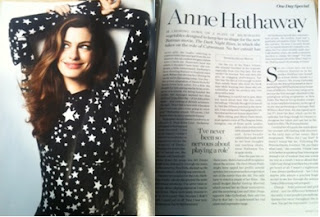
Marie Claire- example article (Tuesday)
This was the beginning of my health article construction.]
Wednesday- today’s lesson was extremely successful. I
focused well and have made a lot of pogress with my health article. I used second
person and included lots of facts in a fluent way and aim to have this article
completed as homework. I think that this lesson was really successful and am
happy with progress I made.
Friday- Today I carried out my photo shoot and all went to
plan! I texted my models on Thursday night to remind them to turn up, and what
clothe they needed to bring. I think that the photo shoot went well and after
flicking through them and creating a contact sheet I am happy with the outcome
and have plenty of images to choose from. Chris (the technician) was very
helpful in terms of lighting, but other than that I was very independent;
guiding the models and telling them what poses I wanted, where to stand, etc. I
took around 50-60 images and think that this was a good amount, as it has now
given me more choice for my article and front cover.

Contact sheet- (Friday)
Homework- I completed my call sheets on Monday lunchtime and
gave them to my models before the end of the day, this made sure they knew
where to be, what time and what to bring.
I also completed writing my health article and proof read
it, my friend Abi also read through the article and said that it was fluent and
interesting to read.

Health article- written up. (Wednesday and completed as homework)
Homework- On Thursday I also started redrafting my ‘Happy Never After’
article, using the feedback I received from my focus group. (See post 'Happy Never After Construction')
Friday, 18 January 2013
Monitoring Log: Week 2
This week I challenged myself to do a lot of work and overall I think I have done quite well.
On Monday I was meant to carry out “language identification and article planning”. It wasn’t until I started researching into my health article on chocolate that I realised how big this task was, however in the lesson I achieved quite a lot. I chose 3 magazines in the women’s lifestyle genre as my research sources; they included Glamour, Elle and InStyle. This was very useful and I gained a lot of information for both my health and fashion articles, this will aid me substantially when writing my articles. SEE BLOG POSTS "Language Identification: Fashion Article" and "Language Identification: Health Article"
The work I didn't get finished in the lesson on Monday, I completed in my free period later on in the day. Monday was successful in that I completed the language research, however I didn't get time to start my article planning. I aim to complete this in a free lesson next week, as I don’t have an exam (which meant revision took priority over my free lessons this week).
Tuesday’s lesson required me to research into any additional information for my breakout boxes. This was successful for my health article, but not for my fashion article. This, again was due to a lack of time, research is a lot more time consuming than I first anticipated when creating my schedule. I analysed a relatively long and factual article that I found online. It discussed the benefits (as well as a few negatives) to eating chocolate. This was very useful, as it covered the same topics as my article will and provided me with lots of interesting statistics that I could quote in my article. SEE BLOG POST "Finding additional statistical research for individual stories/breakout boxes!"
Wednesday’s aim was to create and carry out a questionnaire for my fashion article, as well as create sell lines for my front cover and articles. This questionnaire consisted of 5 quantitative questions and 18 girls aged 16-18 completed this questionnaire. In my free lesson I put this data into pie charts to give a visual representation and allow percentages and comparisons to be seen clearly.
The questionnaire was as follows:


Another challenge I set myself was to come up with sell lines to use on my front cover, I did this in a free period and found it relatively easy and quick to do. This will be a great benefit when creating my front cover and will save me time. My sell lines are shown below:

The questionnaire was as follows:
Please complete the following questionnaire:
This is for my media communication and production course and will help me when writing my articles for my final piece. Your details will not be published without your full consent and your privacy will be protected. If you don’t feel comfortable answering the questions then don’t feel pressured into filling them in. Thank you for your help, it’s much appreciated!
Please circle what sex you are: FEMALE MALE
How old are you? ...........
1) Would you ever shop for clothes in a charity shop? ..................................
2) Do you own any clothes from a charity shop? ............................
3) Do you mainly shop for high street fashions, e.g Topshop? .................................
4) Do you know what the difference is between ‘second-hand clothing’ and ‘vintage?.............................................................................................................................................
5) Do you think that wearing clothes from charity shops is becoming more acceptable?.....................................
The results were:
Another challenge I set myself was to come up with sell lines to use on my front cover, I did this in a free period and found it relatively easy and quick to do. This will be a great benefit when creating my front cover and will save me time. My sell lines are shown below:

Friday's lesson consisted of me monitoring my week’s progress, as well as checking my blog was up to date and making note of what needs to be done over the weekend and next week. Overall I think this week I have done reasonably well to keep on top of my work, especially as I have had an exam. Next week I aim to complete the 'research into any additional information for my breakout boxes' for my fashion article, I aim to get done in free lessons next week.
Thursday, 17 January 2013


Wednesday, 16 January 2013
Research for health article
Finding additional statistical research for individual
stories/breakout boxes

This article is from http://www.healthspan.co.uk/articles/is-chocolate-good-for-you-the-pros-and-cons/ and
discusses the pros and cons of chocolate on your health. I printed out this
article and analysed it in terms of what facts and figures stood out to me and
any interesting information that could be used as secondary data in my article.
Some interesting facts I found included:
In Britain
we consume over 80 million chocolate eggs each Easter (work out as 9kg p.p.)
Cocoa beans
were once used as a form of currency (time of the Aztecs)
40g of
chocolate contains more than 300mg of polyphenols- the same type of
antioxidants that give red wine its heart-protecting reputation.
Dark
chocolate obtains twice as many polyphenols.
British
Medical Journal suggests that a daily meal, with 100g of dark chocolate could
cut the risk of coronary heart disease by a massive 76%: could increase life
expectancy for men by 6.5 years and women for 5 years.
Evidence
found that eating 100g of dark chocolate a day could reduce blood pressure by
an average of 5.1/ 1,8mmHg, which is enough to reduce the chance of a heart
attack of stroke by 21%.
Chocolate
increases brain levels of several chemicals, which produces a mild,
confidence-instilling buzz.
Tuesday, 15 January 2013
Language Identification: Fashion article
I will research into various magazines within the same genre as mine (women’s lifestyle) for fashion articles. I will especially look out for any that compare different fashions, as this is what my article will do. I am going to be looking out for any language techniques used and take note of them, at the same time I will be aware of stylistics; how the pages are laid out and colour schemes, etc.
In Elle there is a selection of 4 pages which look at certain elements of fashion and compare how they can be worn. The first page is titled, “How to wear... the new white dress” Underneath the title is a kicker “It’s a summer staple, but to make the white dress modern, pick an ultra-simple style, then add sporty accessories and sunshine” In terms of image to text ratio this article is very image orientated. There is a small paragraph of text next to each image, giving prices and where the items are from. Although simple, this article is effective in that it gives a visual representation to the audience and is laid out in a very professional way. The same layout and structure is consistent throughout all four pages, this makes it appear branded to the magazine.
Another page in Elle is covered in images of fashion items that the magazine recommends. This is a singular colour scheme, which is white. There is little writing and where there is, it states the prices and stores. The following page is the same, but pastel coloured items, the page is busy, but effective.
Although the majority of fashion articles don’t have much text, there is one in Elle called, “Is this the future of fashion?” This article discusses what the future holds for fashion and whether Twitter, Tumblr and Pinterest “have the power to turn fashion from an elite club into a (very stylish) global democracy”. This article holds quite a serious tone, “The walls have come tumbling down.” However there are rhetorical questions, this will make the audience feel involved and less like they are reading a fact file. There are lighter tones, such as: “But once the genie is out of the bottle, there is no getting it back in...” The use of a fantasy/magical metaphor works well. There are a lot of quotes in this article to back up views given and they are from valid sources (which are stated in the article). This article is very text orientated.
There is an interesting article in InStyle called “Pyjamas” and it goes through the ages of fashion and the most fashionable designs of pyjamas for that era. For example, “1930’s Beach chic” Under every date is a paragraph explaining the fashion and how it was relevant at the time. The language is chatty and casual, “If you’re not brave enough to rock a set, mix ‘n’ match with jeans or a jumper.” This makes the reader feel comfortable with the ideas and is followed with: “The one golden rule? High heels.” I think this article is very interesting and is an unusual take on fashion.
Another article in this magazine is called “The Look” and it compares the fashions worn by celebrities. There is a breakout box comparing their hair styles too. This article is very image orientated article, that doesn’t require much text.
Language Identification: Health article
In order to research well into language techniques, I will look through magazines within the women’s lifestyle genre and identify any language techniques used in a health article. This will give me ideas, helping me write my health article in a way that will appeal to my target audience. Whilst primarily looking at the language used, I will get an idea of layout and colour schemes at the same time.
One magazine I looked at was Glamour: This health article was called ‘What colour is your body craving?” The title is a rhetorical question that is interesting and draws in the audience, underneath the title is a picture of different fruits. There is a kicker: “The easiest way to a healthy body is eating a rainbow of food (and, no, Smarties don’t count!)” this quick sentence summarises the article, giving a fact as well as a hint of humour. The article begins, like the title, with a rhetorical question “You know you’re meant to eat your greens, but what about your oranges, purples and reds?” The use of second person immediately involves the reader, speaking directly to them; this works really well for health articles. The article is then divided up into subheadings such as, “Purple” and “Green” these are each sub divided with “You want to”, “Other benefits” and “Fill up on” this is a simple structuring technique. There are a lot of quotes used in this article to give factual information. The breakout box has a title of “Is white alright?” followed with a “yes” answer and a “no” answer. Overall this article is very factual and straight to the point, it offer valid evidence to back up points and includes rhetorical questions and is written in second person, directly addressing the audience.
Another health article in Glamour is called “Seeing your GP? Don’t hide these 5 facts” again there is a rhetorical question used. This is followed by a kicker: “What doesn’t seem important to you might be exactly that” it’s a contradicting kicker, that is thought-provoking, the audience will want to read on from this. This article is also written in second person and begins with the word “Your” again, giving a personal touch to the article. The article is separated (about half way down the page) into five columns each have a quote as the sub-header. An example of this is “I only drink at weekends...” then in each section there is a quote from a doctor to back up certain points made.
Another article is: “Glamour vs depression” The introduction states that a survey was carried out by Glamour and over “2,000” people responded. This survey is used throughout the article as evidence. It also uses real life stories and interviews. There is a breakout box with symptoms of depression to look out for, there are 9 symptoms listed in a simple way. There is another breakout box on the adjacent page “Five ways to break the taboo” this lists 5 different ways to help. There are quote inserts on the page and some results from the survey are in bold. Overall this is a serious article addressing real life problems, however there are parts that are quite chatty and quite friendly, this is reassuring for the audience.
In Elle there is a double-page article called “the truth about... Vitamin C” The introduction begins with “Fact:” and goes on to summarise the benefits of Vitamin C. There is then a subheading of “less is more” again stating facts about how much is recommended. The article is written in third person “Our bodies...” and “the exact amount we should be consuming” this makes the audience feel involved, and makes the article universal in that everyone is involved. The advice given is written in a factual, but friendly way. There are small diagrams of a bar chart and a pie chart, they give statistical data to back up points. Down the right hand side are more sub-headers that give advice on what products to buy and prices. This article is factual and effective, however it is very text orientated and doesn’t appeal to me through appearance, I will make my article much more attractive for my audience.
Monday, 14 January 2013
Contingency Plan
My Top Ten Project Killers
What could go wrong during production
|
How are you going to avoid this issue? What’s your back up plan?
|
Running out of post production time and not having software at home
|
I am going to ensure that I follow my schedule and if I miss any lessons or have any incomplete work I will catch up/ finish work during my frees or at home as homework. Any Photoshop or InDesign work will be completed at college in my free lessons, as I don’t have this software at home. Running out of time is the most likely problem for me, but I am aware of what I need to do and how tight my time schedule is. Therefore, I will organise my time better.
|
Fonts not installed on C drives
|
I will install all relevant fonts onto the C drive before I start my work on InDesign and Photoshop. This will be done in advance of any producing or editing, to ensure they are there. Should anything happen, for example the fonts are deleted, I am going to make a note of the names of fonts, or the hyperlinks for them, so they are easy to track down.
|
Models not turning up
|
I will make sure I have good communication with my models and they know what day, time and where to meet for the photo shoot. This is very important, as no models means no photo shoot. I will send a text to my models the day before the shoot as an extra reminder.
|
Running out of network space
|
This could be a huge problem, as the photographs will have to be stored on my network immediately. To avoid this happening I will make sure I delete any old photos, or documents I don’t need beforehand. I could also bring a USB stick as a backup.
|
Problems with the photos, could be underexposed, overexposed or out of focus.
|
This will be avoided by checking the photos on the camera as soon as they are taken. I will also ensure that the camera settings are correct and ask for any help or assistance if I am unsure.
|
Might lose a USB stick
|
I will save my work in more than one place, this is very important as there is a potential risk of me losing all my work. I will only use my USB stick for individual pieces of work and not for my whole project.
|
Model might not pose right, framing and eye line might be wrong.
|
Again, I will ensure I have good communication with my models. If they aren’t posing how I want I will politely ask them to move. I will assure them that if they don’t understand anything they shouldn’t hesitate to ask. I will be checking the photos as soon as they have been taken, so will be able to see if any adjustments need to be made. I will also be taking lots of photos, 50-60 photos so there is a wide range to choose from.
|
Computers crashing after you have spent hours perfecting a particular piece of work
|
I am very aware that this could happen, therefore to avoid this I will save my work after about 5 minutes. This will ensure my work is safe. I will also have a back-up copy of my work.
|
External shoots planned but bad weather causes me to abandon the shoot
|
To avoid this I will check the weather forecast regularly up to the day of the shoot. I will also have a back-up day, so if the first day isn’t appropriate I will have a day, for example the following week, available. I will inform my models of this plan.
|
Photo shoots taking a long time set up so that I am only left with a short time to get pictures
|
I will have a practice run of my shoot, this will involve me, on my own, setting up the props etc and see how long it takes me. This means that if I need help setting up the studio I have time to ask a friend to help. I will also book enough time for my photo shoot, so I don’t run over.
|
Subscribe to:
Posts (Atom)